
Project "DO"
Odesa, Ukraine
“We haven’t yet decided whether we will live here or rent it out, so we’d like to see how this space can be organized and arranged.”
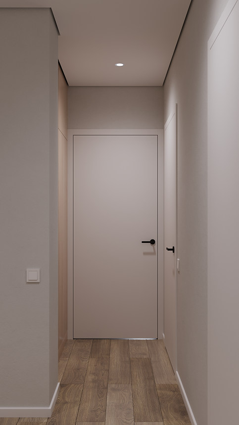
Apartment 8A became an example of how a space can develop its own character and atmosphere even with a layout very similar to a previous project (DO). The clients appreciated the solution we created for DO, so the planning here is almost identical: the same main axes, zoning logic, and functional blocks.
Despite this, we adapted the interior to feel independent — conveying a different mood, ambiance, and spatial perception. The apartment combines comfort and clear circulation with warmth and style, remaining equally attractive for personal living or potential rental.

The client’s request was not only about experiencing creative excitement through aesthetics and visual solutions, but also about discovering a new approach to functional space planning.
Alongside shaping the overall concept, we had to consider every work scenario, circulation logic, and interaction between zones, integrating them into a space whose form imposed clear constraints.
Запит замовника полягав не лише у прагненні відчути творчий азарт через естетику та візуальні рішення, а й у бажанні побачити новий для себе підхід до функціонального планування простору.
Паралельно з формуванням образу ми мали врахувати всі сценарії роботи, логіку руху та взаємодію між зонами, інтегрувавши їх у простір, форма якого диктувала чіткі обмеження.
Architects:
Project area:
Project year:
Location:
Skripnik Mykhailo, Ivanov Mykhailo
61 sq.m
2025
Odesa, Ukraine


61 м2 , вікна з одного боку, витягнута форма. Цей офіс - приклад простору з викликом, який ми не маскували, а навпаки - підкреслили.
Відсікаючи на функціональні зони, ми ще більше витягнули основний простір. При цьому не перекрили джерела природного світла й врахували всі побажання замовника.
Functional Zones.
Visual solutions became a tool for working with the spatial characteristics rather than an attempt to conceal them. We deliberately emphasized the elongated geometry, while dividing the main volume into two functional zones without using partitions — instead relying on furniture, materials, and usage scenarios.
To intuitively soften the perception of excessive length, the space was divided at the ceiling level. The work area was left with exposed concrete, while in all other parts of the office the ceiling is finished in gypsum board. This contrast not only structures the space, but also highlights the distinct character of each zone — more intimate in the lounge area and more open and work-oriented in the shared table area.
⁎ ⁎ ⁎ ⁎
Візуальні рішення стали інструментом роботи з особливостями простору, а не спробою їх приховати. Витягнуту геометрію ми свідомо підкреслили, водночас поділивши основний об’єм на дві функціональні зони без використання перегородок — за допомогою меблів, матеріалів і сценаріїв використання.
Щоб інтуїтивно зняти відчуття надмірної довжини, простір було розділено по стелі. Робочу зону залишили з відкритим бетоном, тоді як у всіх інших частинах приміщення стеля виконана з гіпсокартону. Цей контраст не лише структурує простір, а й підкреслює різний характер зон — більш камерний у зоні відпочинку та більш відкритий і робочий у зоні спільного столу.

Additionally, the work zone is accentuated at the floor level: mosaic tiles outline the contour of the communal table, creating a visual boundary without physically dividing the space and breaking up the long perspective.
The height of the space required a separate approach to scale. To avoid a “well effect” and visually ground the composition, we introduced a decorative accent-green panel along the perimeter of the office. This horizontal band unifies all zones and balances the vertical proportions of the space.
⁎ ⁎ ⁎ ⁎
Додатково робочу зону акцентовано на підлозі: мозаїчна плитка окреслює контур комунального столу, формуючи візуальну межу без фізичного поділу простору та розбиваючи довгу перспективу.
Висота приміщення вимагала окремої роботи з масштабом. Щоб уникнути ефекту «колодязя» та візуально приземлити композицію, по периметру офісу ми провели декоративну панель акцентного зеленого кольору. Цей горизонтальний пояс об’єднує всі зони та балансує вертикальні пропорції простору.


The glass partitions do not reach the ceiling: the upper section of the wall, between the glazing and the slab, is finished with the same material as the main walls. This helps preserve the feeling of a unified space and softens the vertical proportions.
In the work area, the composition is complemented by wall-mounted wooden shelves, while in the lounge zone, suspended shelving made of the same material is used. These elements not only serve a functional purpose, but also break down the scale of the space, adding a sense of humanity and tactility.
⁎ ⁎ ⁎ ⁎
Скляні перегородки не доходять до стелі: верхня частина стіни, між склінням та перекриттям, оздоблена тим самим матеріалом, що й основні стіни. Це допомагає зберегти відчуття єдиного простору та пом’якшує вертикальні пропорції.
У робочій зоні композицію доповнюють настінні дерев’яні полиці, а в зоні відпочинку — підвісні стелажі з того ж матеріалу. Ці елементи не лише виконують функціональну роль, а й дроблять масштаб простору, додаючи йому людяності та тактильності.


Result.
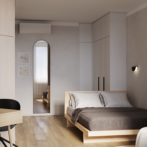
Apartment 8A demonstrates how a space can develop its own character even with a layout very similar to previous projects in the series. Although the planning largely repeats the solution created for Apartment DO, every element — from colors and materials to the kitchen and living room configurations — shapes a distinct mood and spatial experience.
This project highlights that even within a standard architectural framework, it is possible to create an interior that feels fresh, light, and inviting, with carefully considered accents and a harmonious combination of details.
⁎ ⁎ ⁎ ⁎
Квартира 8А демонструє, як простір може набувати свого характеру навіть при дуже схожому плануванні, як у попередніх проєктах серії. Хоч планування майже повторює рішення для квартири ДО, кожен елемент — від кольорів і матеріалів до конфігурацій кухні та вітальні — формує власний настрій і відчуття простору.
Цей проєкт підкреслює, що навіть у межах стандартної архітектурної основи можна створити інтер’єр, який виглядає свіжим, легким та затишним, з чітко продуманими акцентами та гармонійним поєднанням деталей.